Posts in Category: Featured Portfolio Projects
Project posts which are listed as featured projects in the portfolio

Web Spinner
| Status | Complete |
| Development Period | Weekend of August 22nd |
| Target Platform | Windows |
| Development Plaform | Game Maker Studio |
Here’s a link to my entry
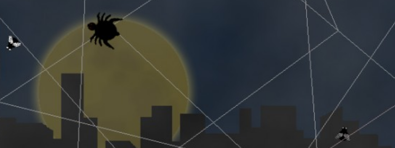
I made this game for Ludum Dare #33. Ludum Dare is a competition where you make a game in 48 hours base on a theme. In this case the theme was “You Are The Monster”. I know several people who are afraid of spiders so I thought it might be fun to make a game where you play as a spider, I also thought it would be interesting playing with the web mechanic. Not including the brain stroming, I ended up completing the game in 16 hours.
Initial Brainstorming
When preparing for the game I tried doing some research into how spiders built their web and also watch a video of the process the spider went through. This video illustrates the concept I was trying to portray. The web remains connected to the spider and the spider must move along the web it has already layed in order to add more lines to it’s web. I also read through the spider wikipedia article. Here’s a quote from the article which I made use of for the design of the game
About half the potential prey that hit orb webs escape. A web has to perform three functions: intercepting the prey (intersection), absorbing its momentum without breaking (stopping), and trapping the prey by entangling it or sticking to it (retention). No single design is best for all prey. –Wikipedia
That said flies wouldn’t always get caught, if they did get caught the web would sometimes break (longer strands are easier to break), and they would occasionally break free after being caught for a certain amount of time.
Programming
I enjoyed the programming for this game. To create and manage a web and had to implement a graph datastructure and in addition to that several operations had to be implemented to make the system work well. When a spider placed a line it needed to create a new vertex (intersection point) and split the edge (web strand) that the spider was currenly on. Additionally I needed to add an edge linking the new vertex and the previous vertex that the spider placed and also needed to split any edges that this new edge overlapped with and the new edge needed to also be split accordingly.
For the spider movement it was always had an edge that it was associated with and it had a value between 0 and 1 representing where it was on the edge. When the spider hit a vertex a new edge would need to be selecting based on the position of the mouse. I decided to add momentum to the spider’s movement so that it could go around corners easier. In order to select which way the spider would go at a vertex I would move the mouse in the corresponding direction. If I moved the mouse too early the spider would often turn around before it hit the vertex. The momentum fixed this issue but it meant you couldn’t quickly change the direction of the spider. In addition to selecting the new edge I had to transform the velocity. The spiders velociy was stored as how quickly it was moving on the edge and it used the 0 to 1 coordinate system that I mentioned early. Ths meant that the spiders speed would correspond to different numbers depending on which edge it was on
One of the challenges was detecting line-line intersections (for when webs overlap) as well as detecting line-circle intersections (for the flies). I ended up consulting the internet and there are some very elegant ways of doing this using vector operations so I implented them into the game and it wored pretty well.
Art
Even though it’s not my specialtly it’s fun to occasionly dabble with art. I did a lot of tracing of reference images to get the look that I wanted. I thought it would be cool to have a large impressive background with the spider operating at a much smaller scale in the foreground. Eventually I decided on a city skyline with a moon for the background and for the web to be attached to a fence in the forground. I feel like the barb wire was one of the things which emphasize the scale of the web and it helped create contrast with the background as a result.
To make the the background and traced the moon, new york city, and added some gradient and blurs to make it look correct. For the foreground I traced a pole and a piece of barb wire. The spider also started out as a trace but I made some minor modifications to make it rounder and more cartoony. Once I tested it out in the game I noticed that the spider seemed to blend in with the background. I initially tried to solve this by making the design of the spider more elaborate but just couldn’t make that look right. Then I tried adding some clouds over the background and that worked out well.
Game Design
Game design was tricky. In order to add a end state I added a hunger bar which was regenerated by eating flies. Then I needed to design it so that it would be more difficult to find flies as time went on. I wanted the web placement to be strategic. Players should be trying to fight the tradeoff between coverage and density. With high coverage you’re more likely to catch flies however you’ll probably have longer strands which will be easily broken. The safer strategy is the aim for high web density. With this strategy your web won’t break easily however if your coverage is too low you won’t catch enough flies. To make the strategy work this way and manage the difficulty curve I had to adjust several variables and as well as how they changed over time. These variables included fly spawn frequency, probability of fly getting caught, how long the flies stay stuck, web hit points and web recovery rate. I also decided to keep flies from spawning for the first 10 seconds to give the player some time to setup the initial structure of the web.
When I was doing final testing I still wasn’t sure I had the design working the way I wanted it too. When I played and concentrated I could always reach a point where I had high density and high coverage this is not ideal, but I wasn’t sure how clear the mechanics would be to players so I didn’t want to make it more difficult.
Results
Initially the game was crashing for a lot of people. I tried playing it for extended periods of time but couldn’t recreate the crash. I had a friend of mine test out the game and it took him 5 seconds to crash it, apparently all you had to do was create webs repeatedly by clicking as fast as you can. After I could recreate the error fixing it wasn’t a major issue.
After it was fixed people were mainly having issues with the controls and it didn’t seem like a lot of the deeper mechanics were clear to the players. After watching some other friends play it, it looked like the momentum was one of the reasons why the movement was difficult, but I didn’t want to remove that for fear that it will create a different issue. Also people were generally placing the mouse based on where they wanted the final position of the spider to be rather than the direction they wanted the spider to go in the short term. I’m not sure how I could fix this without adding some sort of pathfinding. This would be difficult since I’d need to search the web for the point that’s closest to the mouse and additionally I’d have to implement A* or something like that and I’m not sure how well it would run in real time. For the clarity issue I can’t think of a way to fix this without front loading a lot of information on the player.
My ranking ended up being #572 (out of the 1199 compo entries) which is ok but the category I was most proud of was innovation where I ranked #89 which is really good and I”m glad that showed through because I did work hard to make a unique game. I think I’d score it at a 73/100 because even though I’m proud of the technical achivement behind the game I don’t think the final product was fun for people to play and controls and the vagueness of the mechanics created a large barrier to entry.
Angle Shooter
| Status | Complete | |
| Development Period | Summer 2010 – Summer 2011 | |
| Target Platform | PC | |
| Development Plaform | Game Maker 7 |
| Status | Cancelled |
| Development Period | September 2012 – December 2012 |
| Target Platform | PC |
| Development Plaform | Game Maker Studio |
| Contributions | Programming |
| Co-Creators | Oðinn Hullekes : Art |
| < | > |
This was my 3rd attempt at starting a development team. Odinn was in charge of art and was based out of the Netherlands. I was in charge of programming and I was based here in the US. This got farther along than previous attempts, largely because there were only 2 of us and we were communicating a lot more. We even made a few devlog episodes. Unfotunately we eventually decided to stop because it was difficult to stay in sync, we had busy schedules, we had made the scope too large and we both sort of lost interest in the project.
We had a complex story in mind. The main character was a boy who randomly gets powers for some unknown reason and he spends the game running from the government in addition to trying to better understand his powers. There were several powers we had in mind. The ones that eventually got implemented were telekenesis, where the player can lift objects with his mind, and a couple variations of force push.
Other than gaining more experience working in teams I also gained a lot from a technical perspective. I wanted to try and make the force push realistic looking so I was very ambitious with the physics system. I ended up getting it working pretty well but rotation was what stumped me. Luckly yoyogames had recently implemented a physics system into Game Maker Studio. It was difficult to learn because using physics meant that I had to do a lot of the basic operations in Game Maker using the physics system rather than the version I was experienced with. I eventually got used to it and was able to make some pretty neat effects. Using this knowledge I was later made a youtube series about the intricacies of using physics in game maker.
Rubiks Cube Simulator
| Status | Completed |
| Development Period | March 2013 – May 2013 |
| Target Platform | PC, Mac |
| Development Plaform | Java Swing |
| Status | Completed |
| Development Period | March 2014 – May 2014 |
| Target Platform | Android |
| Development Plaform | Eclipse w/ Anodroid SDK, Java |
| Contributions | Programming |
| Co-Creators |
Austin Bott: Programming Brad Beyea: Character Art |
Link coming soon, if it takes too long remind me.
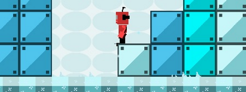
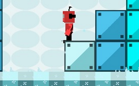
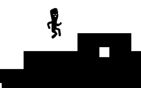
This was a project I worked on with Austin for our mobile development class. It was the first game I’ve worked on which was made (almost) completely from scratch in a programming language. It took us several hours to just get rectangles to be drawn on the screen in the way that we wanted to and we built it up to be a solid platformer with score and level detection.
The platform is a cross between standard runner games such as Bit Trip Runner or The Impossible Game or Geometry Dash and a concept from an old flash game called Shift. So like runner games you’re being pushed through a level and pretty much the only thing you can do is avoid jump, however our game implements an extra mechanic which was taken from Shift. You can flip the terrain so that hills become trenches, gravity flips and the player moves to the opposite side of the screen.
The name is pretty perfect. The “Shadow” sounding aspect relates to the black/white art style. The embeded “deux” is the french work for 2 which reflects the duality of the terrain. The term “Shadeux” is a french word on its own and it’s sometimes called Darcour, or Parcour used for illegal purposes. This nicely reflects the platforming and also reforce the black and white art style.
We designed the levels using a level editor I made for one of the ealier verions of Preying Mantis (this was before the development of that game shifted to Game Maker Studio) I’ll probalby release it at some point. It works well for games with simple level design.
Perspective
| Status | Complete |
| Development Period | September 2014 – December 2014 |
| Target Platform | Mac, PC, Web |
| Development Plaform | Unity 3D |
| Contributions | Levels Design : Grass 4, Ice 1, Sand 4, Space 1, Space 3 Programming : Realms Mechanic, Bounding, Menu Cube, Misc |
| Co-Creators |
Peter Aquila: Project Lead, Programming, Level Design Nick Shooter: Project Lead, Level Design, Programming, Music/SFX, Art Daniel Xiao: Level Design, Art Larry Smith: Art, Character Animation Andy Xue: Programming, Level Design Michael Chi: UI Art |
Click Here for download links
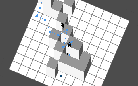
This is a project I worked on at school with a club called VGDev. VGDev joins up in the beginning of the semester and splits up into about 5 teams. The goal is for each team to have a game completed by end of the semester. VGDev is a really cool club. You can not only learn a lot about game development but the philosophy of “getting the game done” is great since it forces you to work through the hardest part of the project and stick with it which is a valuable skill no matter what the project is that you’re working on.
This was my first experience with Unity and also my first experience with C#. C# is very similar to Java so I didn’t learn too much there but I did learn a lot just working with Unity. All my previous experience was with Game Maker, Unity is different in that it’s primarily a 3D engine and it uses an official programming language rather than a simplified language made for the engine. It felt nice being able to use C# because it gave me more control and there was less ambiguity in my code.
Cube Defense
| Status | Complete |
| Development Period | Some weekend June 2014 |
| Target Platform | PC |
| Development Plaform | Game Maker Studio |
| Status | Complete |
| Development Period | May 2013 – October 2013 |
| Target Platform | Android |
| Game Engine | Game Maker Studio |
| Contributions | Programming |
| Co-Creators | Spyros Kontis: Art & Game Design |
Click Here to find it on Google Play
This a project I made with Spyros Kontis, he found me on YouTube and asked to help develop this game. This was the largest project I’ve worked on at the time and fighting games in particular are a tricky game to develop. That said it got finished and I’m very happy with how it turned out. Throughout the process I learned a lot about organizing my code to make it readable and to also avoid redundancies as much as possible. I started with 8 fighting character objects but through the use of parenting and some clever scripts I managed to get it down to a single parent object.
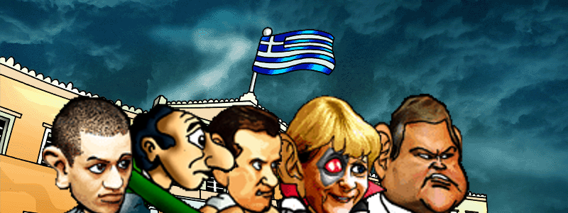
The political satire game about the greek government, I liked the premise. The beginning includes a Star Wars style scrolling text intro describing the story which is something I’d never done before. Another new thing for me was that it had to have a language selection feature. The 2 languages were Greek and English. Greek is a particularly difficult to implement since it uses a different alphabet. A few months prior to this I made a tutorial about custom fonts. Luckily greek has fewer letters than the English so I was able to create a special “Greek” font which mapped all the ASCII letters to Greek looking letters.
Another major accomplishment was implementing the AI. I did so using a state machine which included a ~12 node system with various connections between the nodes. I’d never made one before and I’m very happy with how the result turned out.




Recent Comments