Posts in Category: Portfolio Projects
Project posts which are listed in the portfolio
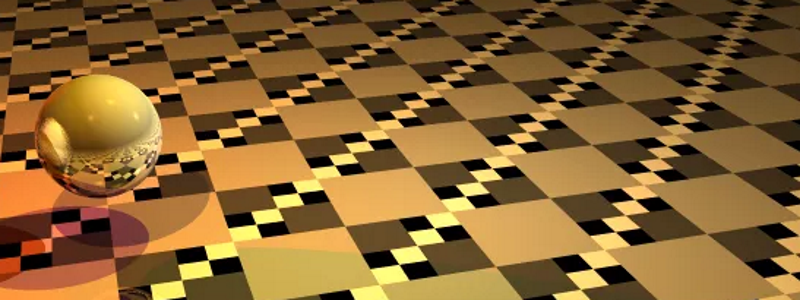
Raytracing Graphics Renderer
| Status | Complete |
| Development Period | September 2015 |
| Target Platform | Web |
| Development Language | Typescript |
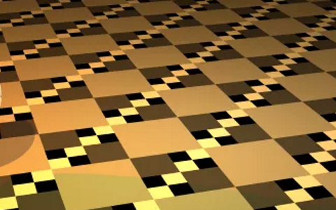
This was a project for my Computer Graphics class. We were given a program which could render an animation using raytracing and we needed to modify the program so that it included anti-aliasing and motion blur.
I thought raytracing was interesting. It essentailly emulates what’s happens in real life by simulating how rays of light interact with the environment. It’s pretty intuitive and due to the way it’s designed, more complicated graphics phenomenon such as shadows, reflections and motion blur can be easily implemented. This makes the final image look really pretty which is why companies like Pixar use raytracing to render the graphics in their films.
The problem with raytracing is that it’s really slow. Animation companies require insane amonts of computing power to render their movies and even then it takes several minutes to render each frame. There are two reasons why it’s so slow. 1. There’s a lot of information to process. When each ray hit’s an object it casts more rays to check for reflections and other light sources. This results in several layers of recursion and creates a combinatorial explosion. 2. Due to the nature of the algorithm it can’t be computed in parrallell. This means that it has to rely on the CPU rather than the graphics card.
The other method used for graphics is called rasteriztion. It involves using a series of triangles which are colored, positioned, and oriented in such a way that it looks like a real object. It’s really fast becuase each of the verties of the triangles can be processed in parallel on the graphics card and then the triangles are quickly drawn using a rasteriztion algorithm. This techiniques allows for video games to have both good looking graphics and high frame rates. The draw back is that it’s really difficult to simulate more complicated phenomenon. It has taken many years of research to get rasterzation techniques to generate the images that are possible today.
Allow me to explain how we were required to modify the raytracing algorithm for this project. By default 1 ray is sent out for each pixel and it will determine the color of that pixel based on which objects in hits and how the lighting effects that point on the object. The problem with this is that the edges of objects end up being really jagged since each ray either hits or misses objects and at lower resolutions the edges of objects turn out looking pixelated. To fix this issue we used super sampling. Each pixel sends out several rays and then the results from those rays are averages to get the final color. This results in much smoother edges.
This other issue was motion blur. Here there are still multiple rays sent out for each pixel only the rays are cast out at different times. If the object is moving fast and it’s only overlapping with a particular pixel for a fraction of a frame then many of the rays will miss the object which results in a blurring effect.
Anyway I thought this process was pretty cool so I figured I’d share it.
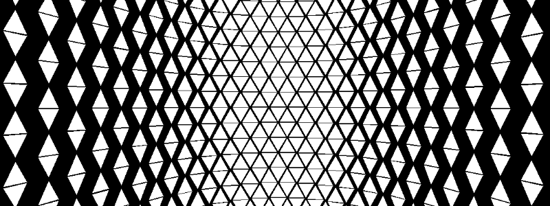
Triangle Board
Click Here to see the source code
This made this project shortly after following a series of Graphics Tutorials by TheBennyBox I made it because I wanted to practice the graphics concepts taught in the series and I also wanted to get some practice working with github.
It was a really cool series and I’d recommend it to anyone who wants to learn more about 3D graphics. It’s easy enough to think of the screen as a grid of pixels and from that perspective it’s easy to make sense of how graphics are handled in 2D projects. However for most people know nothing about the process of taking that 2D grid and drawing 3D models on it. After following this tutorial I felt like I understood that process completely.
It was done using “Software Rendering” which means it was done with a more standard programming language which doesn’t communicate with your graphics card. Most languages you would think of fall into this category. Examples include Java, C++, Python, and most others. In this case we used Java. For it to have been considered “Hardware Rendering” we would have had to use OpenGL or another language which communicates with the Graphics Card. Hardward Rendering is much faster than Software Rendering. Really the only value in Software Rendering is it’s educational value. I was able to gain a better understanding of 3D graphics because it was written in the procedural manner which I’m used to.
All that said I made this triangle animation and I think it looks really cool :).

System Manager
| Status | Cancelled |
| Development Period | June 2014 |
| Target Platform | PC |
| Development Plaform | Game Maker Studio |
| Contributions | Programming |
| Co-Creators | Brad Beyea |
Click Here for a download link
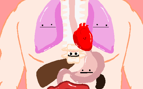
Me and Brad made this game for the 2014 Indie Game Maker Contest we had the month of June to make the game from start to finish. Our idea was to make a game where you had to micro manage the various systems in the body. These’s included the cardio respiratory system (lungs), pulmonary system (heart), digestive system (stomach), and immune system (spine). Through out the game the state of each system is constantly being depleted and you need to switch between them constantly to ensure the system doesn’t fail.
There was a time difference misunderstanding and we found out just in time so we abruptly turned in our game without it really being finished. I posted a link to find the game, and if you try it out you’ll quickly notice there are several terrible issues with it including extremely fast system failure and a music loop issue. Aside from the early submission the game still had a lot of problems. In a continuous game like this with so many balancing variables it very tricky to make a reasonable difficulty curve. The immune system in partiuclar was not setup well for the style of the game.
We did learn a lot from the experience. This was the the first project we saw through to completion (sort of) and we learned a lot about what worked and what didn’t in terms of working in a team. Another new thing was that all the visuals were made using vector art instead of raster art. This meant we didn’t have the same scaling issues that were present in Preying Mantis. We even took extra advantage of it by having a lot of zooming in the game.
I was a good excersize for me to learn how to use vector art in Game Maker Studio. Another new thing was that the entire game only used a single room, so I had to add a lot of code for managing which view you were currenly in as well as what needed to be enabled in that view. Making the view pan a lot made the game seem really dynamic and I’m really happy with how that turned out.
Hercules: The True Story
| Status | Complete |
| Development Period | October 2013 – November 2013 |
| Target Platform | Tizen, Android |
| Development Plaform | Game Maker Studio |
| Contributions | Programming |
| Co-Creators |
Spyros Kontis: Art, Game Design Markus Lappalainen: Music |
Click Here to find it on Google Play
“>Click Here to find it on Google Play
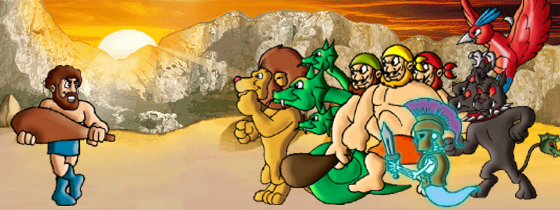
This was another game I made with Spyros which buildt upon our fighting game engine. This was my favorite of the 3. I liked the theme a lot and I thought that the art looked best in this one. It also had a more neat storyline and we had custom music made for this one which really increased the overall value.
This game was made specifically for the Tizen App Challenge. There was a lot of money in prizes available, and since we already had a fighting game engine and Game Maker recently started supporting Tizen we figured we’d try to submit something. Tizen is a new mobile platform which is designed to be a cheaper version of android. The makers wanted to populate their app library which is why they invested so much in this contest. I think they also influenced yoyogames to implement a tizen module in Game Maker Studio.
On a technical level I also added some new things. The enemies had more dynamic mechanics and your could select your levels from a map of europe which corresponded to the locations of the individual bosses. The game overal was more mobile friendly. You’d traverse through the story line by swiping the slides on the screen and you would also scroll through the map in this manner.


Preying Mantis
| Status | Cancelled |
| Development Period | September 2013 – April 2014 |
| Target Platform | PC |
| Development Plaform | Game Maker Studio |
| Contributions | Programming |
| Co-Creators |
Brad Beyea : Art, Game Design David Payette : Programming Jacob Royal : Music |
There were several fundamental problems we were having when working on the project. For organizing the project we mainly worked through Google Drive, which wasn’t the most optimal way to work on team projects. We were using Raster Art (art made with pixels), so there were constant trade offs to be made considering the level of detail that would be necessary and the resolution that would be best suited for all devices. We considered working with multiple resolutions but I’ve tried that before in Parliament Fighter and that’s not fun (or at least the I did it wasn’t fun). We had problems with Scope Creep, we greatly underestimated the amount of time it would take us to develop certain aspects of the game, and including complex story elements has a tendency to lock you into a large scope from the beginning. Having the youtube series seemed like a cool idea and they were fun to make but there was a direct tradeoff in that time spent working on the youtube videos took away from time spent on the actual game.
Despite not finishing the game the issues in this project helped us to not make the same mistakes in future projects. I also was able to implement some features which I’ve never worked with before. One of these systems was a lighting engine. I originally tried to make it myself but ended up using a lighting engine someone else made instead (Unfortunately I couldn’t find the original engine but I linked to where I found it). This was really efficient and created a pretty cool effect.
Another major implementation for me was the pathfinding. I implemented an A* pathfinding algorithm from scratch for the first time. Not only that but this was more complicated than many of my future implementations. I created a graph by generating nodes a certain distance from each corner in the level and then checking each pair of nodes to see if enemies could travel from one to the other. The AI’s would find the optimal series of edges to follow, taking into account how far individual nodes were from the player as well as how long individual edges were.
Devlog Series
| < | > |
PewDie Flap (for Android)
| Status | Complete |
| Development Period | August 2014 |
| Target Platform | Android |
| Development Plaform | Game Maker Studio |
| Contributions | Programming |
| Co-Creators | Spyros Kontis |
Click Here to find it on Google Play
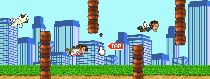
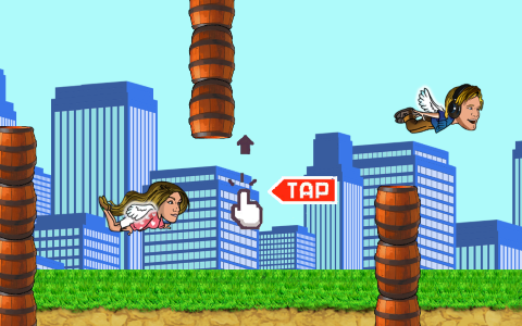
Spyros had done the art for the iPhone version of this game (which is the version you see pewdiepie playing above) and requested that I make a port for Android. I ended up remaking it from scratch in Game Maker. It was a very fun experience, it was a small game so the final project went by with none of the stressful issues that ususally come around with larger projects. I made the bulk of it in 3 Hours, then we sent it back and forth making tweeks for about 2 weeks, and then it was done. I wish all projects were like that :).
Bundestag Fight
| Status | Complete |
| Development Period | November 2013 – December 2013 |
| Target Platform | Android |
| Development Plaform | Game Maker Studio |
| Contributions | Programming |
| Co-Creators | Spyros Kontis: Art, Game Design |
Click Here to find it on Google Play
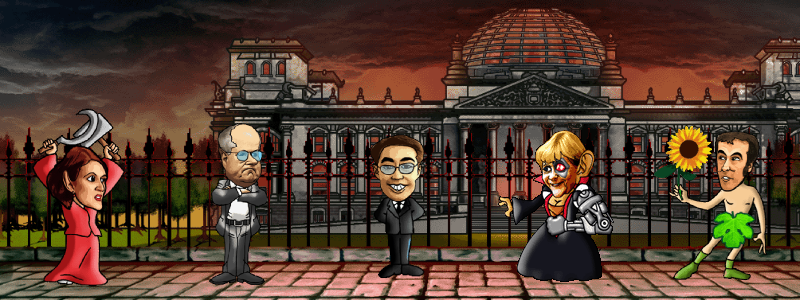
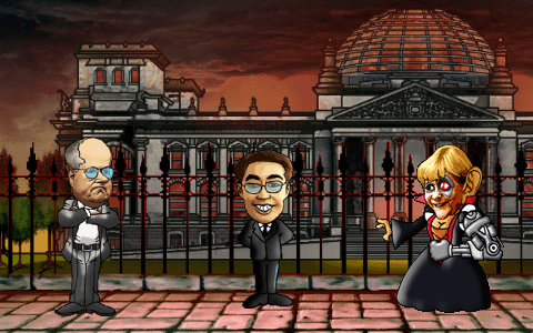
This is another project I worked on with Spyros. This was specifically developed as an entry for the Tizen App Challenge. There were many sections that could be submitted to in the contest and the sum of all the prizes added up to more than 4 million dollars. I’m pretty sure the primary purpose was a baseline of quality apps developed for the Tizen store which is why the company contributed so much money towards it. I believe this competition was also the reason why Yoyogames added Tizen as one of the valid platforms for Game Maker.
We didn’t win but it was a good experience and this turned out to be my favorite of the 3 fighting games I made with Spyros. I think the art style looked the best in this game, music was made especially for the game which sounded pretty good and I also liked the Hercules theme in general.
There were some new features to the game apart from a different theme. The story line was portrayed through an interactive slideshow and it developed as you beat more bosses. You could select the bosses by choosing between icons on a map of Europe and styles of the individual bosses differed more. Compared to the other games this one was also designed more with the mobile platform in mind. During both the slide show and the map the user could navigate with swiping, yet another thing I’ve never tried out before (although since then I have made a generalized extension for mobile integration which can be found on the Game Maker Market place)
Recent Comments