| Status |
Complete |
| Development Period |
Summer 2010 – Summer 2011 |
| Target Platform |
PC |
| Development Plaform |
Game Maker 7 |
Click Here to download exe
Angle Shooter was a very special game for me. It was the largest solo project that I’ve worked on up till this point. Not only did I greatly develop my programming skills with this project, but it also shows the peak of my level design and artistic abilities. All the the levels were hand drawn. I used graph paper and some marker to make the levels and then I scanned them in and set them to be the backdrop of my levels. Each level was carefully crafted to be unique while at the same time maintaining a proper difficulty curve. New mechanics were also consistently introduced as the levels progressed.
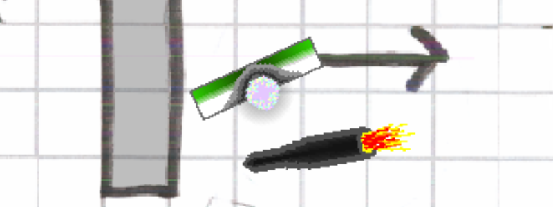
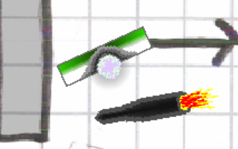
When making the game the basic idea I wanted to elaborate upon was the rectangular shape of the player and the different trade offs that were involved when navigating terrain and fighting enemies. You move the rectangle with the arrow keys and you’re able to roatate it by using the mouse. When fitting through tight spaces you often have to rotate the player to the correct angle to ensure that it can fit through the space. In combat you can choose for the player to face the enemy or be perpendicular to the enemy. In order to shoot at the enemy you have to be facing it, however this also leaves you the most exposed and it makes it harder to dodge the enemies shots. In order to expose the least amount of surface area the character must be facing perpendicular to the enemy. The enemy shoots in bursts of 5 or 6 shots so you want to position the character accordingly to maximize damage and minimize exposure. I’m not sure how well the level design enforced this mechanic but that was the idea anyway.
From a programming perspective this was tricky due to the shear amount of feature that the player needed to be able to incorporate. The rotation was a tricky problem for a long time since I couldn’t use a simple box for collision checking and you could rotate the player to make it collide with walls which was not something I was used to incorporating. Additionally the player could have speed upgrades, shooting upgrades, various keys and the ability to change color. The health bar and the key inventory were incorporated in the character image. I’m happy with the result. The character was able to convey a lot of information without looking cluttered. All of the features I have mentioned needed to be applied to the player and whenever you have a lot of things working in parallel you pretty much always run into issues with odd cases where the feature conflict each other.
At the point of making this game I had a pretty sizeable toolkit of game maker tricks that I had learned. On this project I feel like I did a good job of using the different tricks in variation and using little bits only as needed without making any particular feature or mechanic too blatent.


Recent Comments